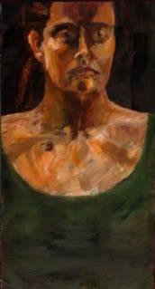
Oil on panel
Art objects to the lie against life that it is pointless and mean. The message coloured through time is not lack but abundance, not silence but many voices. Art, all art, is the communication cord that cannot be snapped by indifference or disaster. Against the daily death it does not die.

1 comment:
This self-portrait and the following figure study are my two favorite. Aside from being well-constructed, I like how you've made the women go off the edge of the page. In the self-portrait, it makes you seem larger than life -- you can't be contained in a simple, single canvas. Also, the angle of the portrait adds to that largeness.
How the woman in the figure study disappears off the edge can be viewed in a few different ways, all fascinating. I like the idea that, even though she is physically laid bare for all the world to see, there is still a large part of her that we don't know because it doesn't fit on the canvas.
All that extra negative space adds to it, too. There is a lot left that can be filled -- does that refer to the woman in the figure or to our understanding of that woman?
Your froggy, bloggy friend,
Andyman
Post a Comment